A guide to silk, colour and the bedroom
Navy Silk Bedding: Color, Weave, and Styling in Gingerlily Collections
Navy silk bedding has a particular kind of presence: grounded but not heavy, polished without feeling formal. Its deep blue surface changes with the light, revealing the quiet sheen of silk and bringing a considered sense of depth to the bedroom. The most successful schemes balance that richness with thoughtful choices in fabric weight, texture, care and the lighter tones around it.
Gingerlily’s silk bedding offers a useful reference point for exploring those choices. From a Summerhill Blue fitted sheet to crisp white pillowcases, its pieces show how a room can move between tonal harmony and gentle contrast. The aim is not to make every element match exactly, but to create a palette that feels composed, comfortable and personal.
Why navy works in the bedroom
Navy is among the most adaptable colours in a bedroom palette. It has the visual depth of a dark shade, yet its blue undertone keeps it more inviting than pure black or stark charcoal. Depending on its exact tone, navy can read as maritime, inky, softly smoky or almost midnight. That range makes it a natural choice for a room intended to feel restful, but not anonymous.
On silk, the colour takes on another dimension. Silk’s surface reflects light differently from a matte cotton weave, so a navy duvet cover or pillowcase may appear deeper in the folds and brighter where the fabric catches daylight. This variation gives a solid colour a sense of movement without introducing a print. In the evening, warmer lamps can bring out a softer, more muted cast; in daylight, the same textile may look cooler and more distinct.
This interplay is part of the appeal of navy blue silk bedding. Rather than functioning as a flat block of colour, it becomes a changing surface—one that brings visual interest to a bed even when the surrounding room is deliberately simple. White walls, pale wood, warm neutrals and muted greens can all sit comfortably beside it. The effect depends less on strict rules than on the balance between dark and light, smooth and textured, cool and warm.
It is also a shade with flexibility across seasons. In a light-filled summer room, navy can lend definition to a pale scheme. In winter, layered with cream, taupe or warm wood, it can feel intimate and enveloping. The colour can therefore provide continuity through changing décor, rather than demanding a complete bedroom redesign.
A note on blue: choosing the right depth
“Navy” is often used as a broad description, but blue bedding ranges from near-black indigo to lighter, more open shades. Before building a palette, consider how the colour will appear beside the room’s fixed elements: wall paint, flooring, headboard, curtains and the light that enters through the windows. A small fabric sample, where available, can be helpful because the same blue may shift noticeably between morning and evening.
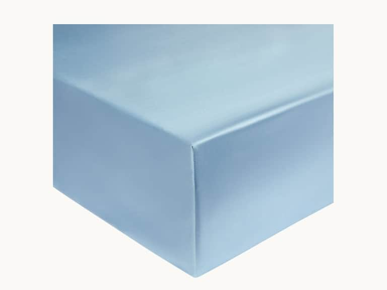
Gingerlily’s Summerhill Blue Silk Fitted Sheet is a useful point of comparison for anyone considering a blue silk bed. It is described as 100% mulberry silk with a 22 momme weight and a 35-centimetre pocket depth. Its named colour is Summerhill Blue, not navy; the distinction matters when coordinating tones. A lighter or more open blue can complement navy by softening the overall contrast, while a closely matched blue creates a more tonal, layered effect.
Think of the bed as a composition rather than a single colour choice. A deep blue duvet cover may anchor the scheme, while a lighter fitted sheet, pillowcases or throw introduces variation. Alternatively, a blue sheet can become the lead element, with white, ivory or soft grey around it. Either approach makes the bedding feel intentional without requiring every piece to come from one exact colour family.
When comparing blues, look at undertones as well as depth. A blue with a cool, grey cast may sit naturally beside silver grey or white. A greener or more muted blue can feel at ease with sage, natural linen and warmer timber. The key is to let undertones converse rather than compete: a room can mix shades successfully when they share a sense of warmth or coolness, even if their values differ.
Silk fabric weight, explained
Silk bedding specifications often include a measurement in momme, a traditional unit used to describe silk fabric weight. It is a useful comparison point, but it should not be treated as a complete measure of quality or comfort. Fibre, weave, finish, construction and care all contribute to how a textile feels and performs. Two pieces with the same momme figure may still have a different character depending on their design and make.
Many Gingerlily silk bedding pieces in the available range are listed at 19 momme, including several pillowcases and flat sheets. The Summerhill Blue fitted sheet, by comparison, is listed at 22 momme. Those numbers describe different fabric weights, not a simple ranking of “better” and “worse.” A lighter fabric may feel especially fluid; a heavier one may offer a more substantial hand. Personal preference, intended use and the feel of the complete bed are all relevant.
When selecting sheets, consider the relationship between weight and how you like bedding to drape. A fitted sheet has a practical role: it needs to accommodate the mattress and remain secure. The Summerhill Blue sheet’s stated 35-centimetre pocket depth is a useful detail to compare with the height of your mattress, including any topper. For a smooth result, check the pocket dimensions rather than assuming that all fitted sheets fit every bed.
Fabric weight is only one aspect of comfort. Silk is valued for its smooth hand and breathable feel, but individual experiences differ, and no fabric can guarantee a particular sleep outcome. Consider your room temperature, layering habits and preferred tactile feel. Silk may be worn alone as a close-to-skin layer or combined with cotton and other materials for a more varied bed.
- Check the product details: confirm fibre content, listed momme weight, dimensions and construction.
- Consider the whole bed: pillowcases, fitted sheets and duvet covers may use different weights or finishes.
- Prioritize fit: pocket depth and mattress size matter as much as colour when choosing a fitted sheet.
- Follow the care label: washing and drying guidance helps preserve the fabric’s surface and sheen.
The art of coordinating pillowcases and duvet covers
A navy duvet cover can set the tone for the entire room, but the supporting pieces determine whether the result feels crisp, layered or deliberately dramatic. Matching pillowcases create a continuous field of colour and let silk’s reflected light do the work. Contrasting pillowcases break up the dark surface and draw attention to the bed’s shape and arrangement.
White is the most direct counterpoint. Gingerlily’s White Silk Pillowcase is made from 100% mulberry silk, listed at 19 momme, with a knife-edge finish and envelope closure. Against navy, white brings clarity and a fresh, almost architectural note. The contrast can feel especially polished when the rest of the room includes pale walls or a white duvet layer. It also offers an easy way to introduce silk without committing to a fully dark bed.
For a quieter combination, consider ivory, silver grey or another softly neutral tone. A pale neutral can soften the jump between white and navy, while a blue that is lighter than the main cover offers a tonal transition. A useful rule of thumb is to choose one leading shade, one supporting colour and one small accent. This keeps a layered bed from feeling overly busy, particularly when the room already contains patterned curtains, an upholstered headboard or decorative rugs.
Closure and finish influence appearance as well as function. An envelope closure keeps the opening discreet, while an Oxford-style border frames the pillow with a more pronounced edge. A knife-edge pillowcase has a clean, tailored outline. These construction details can guide the visual language of the bed: a bordered case brings a little formality, while a plain edge feels pared back.
It is not necessary for every piece to match precisely. A navy cover with white pillowcases can feel deliberate rather than unfinished, especially when repeated through a small accent elsewhere in the room—a blue-bound book, a ceramic object or a line in a rug. Conversely, a monochromatic blue arrangement benefits from differences in texture and proportion, so the bed does not read as one uninterrupted dark mass.
Building a bedroom palette around navy silk
Start with the largest surfaces. If the walls are pale, navy bedding can act as the room’s strongest colour statement. If the walls are already dark, choose a blue that offers enough tonal separation to define the bed. A headboard in natural linen, warm brown or pale timber provides a textural pause between wall and bedding; a dark headboard can extend the mood, but may call for lighter pillows or a throw to keep the arrangement legible.
Neutrals give navy room to breathe. White has crispness; ivory and cream add warmth; grey offers a cooler, quieter transition. Natural textures—linen, wool, woven cotton, wood and matte ceramics—can temper the shine of silk. That contrast is often more compelling than filling the room with additional glossy surfaces. A silk bed is most striking when the rest of the setting lets it be a focal point.
Green can be a particularly natural partner for blue. Sage, olive and muted botanical tones add depth without turning the palette into a high-contrast scheme. A warm accent such as camel, ochre or soft terracotta can shift the mood in a more expressive direction. Use these colours in measured amounts: a cushion, a blanket or a small decorative detail is often enough.
Pattern can be introduced, but it need not compete with the silk. Fine stripes, restrained checks or botanical motifs can add character when the background colours repeat those already present on the bed. If the navy is the principal statement, keep patterns on a smaller scale or use them away from the largest textile surface. If the bedding is otherwise plain, a patterned cushion or throw can provide a gentle counterpoint.
Lighting deserves a place in the palette conversation. Cool daylight can make navy appear sharper, while warm bulbs may draw out a softer, more intimate quality. A room with both warm bedside lamps and natural daylight will reveal more tonal variation over the course of a day. This is one reason silk bedding can feel especially expressive: the fabric’s sheen responds to its surroundings instead of presenting a uniform matte colour.
Care that preserves the finish
Silk is a natural fibre, and gentle handling helps maintain its smooth feel and appearance. Care instructions differ between products, so the label for the specific item should always take precedence over general advice. Some Gingerlily bedding descriptions call for a delicate machine wash at no more than 30°C, a mild liquid silk detergent, air drying and a cool iron where needed. Those instructions are not universal for every silk product, so check the details before washing.
Before laundering, fasten closures where practical and turn pillowcases or duvet covers inside out if the care guidance recommends it. A delicate cycle and a suitable detergent can reduce unnecessary stress on the fibres. Avoid substituting a standard care routine for the instructions supplied with the item; silk-filled pillows, removable silk shells and silk sheets may require different approaches.
Air drying is commonly recommended for the cited silk sheets and pillowcases. Choose a shaded, ventilated place rather than leaving silk in harsh direct sun, which can affect delicate fabrics and colour over time. If ironing is permitted, use a cool setting and take care not to apply excess pressure. Store clean bedding in a dry, well-ventilated space, and avoid compressing delicate pieces for long periods.
Care is part of the practical character of silk bedding. A beautifully chosen shade is most satisfying when it remains part of regular life rather than being reserved for special occasions. Understanding the washing instructions before purchase helps set realistic expectations and makes it easier to decide how silk fits into your routine.
A considered approach to choosing a set
Before settling on navy silk bedding, think about what you want the room to say. Do you want the bed to feel calm and minimal, or rich and layered? Is the intention to introduce a single dark accent, or to make blue the defining colour? These questions help narrow choices more effectively than starting with a long list of decorative accessories.
Next, check each piece on its own terms. Confirm whether it is a fitted sheet, flat sheet, pillowcase or duvet cover, and note its fibre content, weight, closure and dimensions. In a collection that includes multiple blue tones, distinguish the colour names carefully: Summerhill Blue is a specific shade and should not be assumed to be identical to navy. The difference can be used creatively, but accurate expectations make coordination easier.
Then establish the supporting palette. White is a confident partner, as seen in the White Silk Pillowcase; a blue fitted sheet such as the Summerhill Blue Silk Fitted Sheet offers a softer tonal route. For a broader scheme, add one warm neutral and one tactile material beyond silk. The result can feel considered without being overly coordinated.
Finally, let the bed evolve. Begin with the pieces used most often, then add layers as you learn how the colour behaves in your room. A silk pillowcase can introduce the fabric’s smooth surface on a smaller scale. A fitted sheet brings blue into the bed’s foundation. A duvet cover makes the strongest visual statement. There is no single correct order; the right starting point is the one that fits your habits and the atmosphere you want to create.
The lasting appeal of a blue silk bed
Navy silk bedding is compelling because it brings together two qualities that are often treated separately: a confident colour and a tactile, light-responsive fabric. The blue gives the room structure; the silk keeps that structure from feeling rigid. Subtle shifts in sheen give a plain surface character, while considered contrasts let the bed feel composed rather than uniform.
Gingerlily’s range provides useful examples of how to make those choices tangible. A 22 momme Summerhill Blue fitted sheet offers one point of entry into blue silk bedding, while a 19 momme white silk pillowcase demonstrates the crispness of a light contrast. Neither needs to be treated as an exact substitute for a navy piece. Instead, they illustrate the broader principles of shade, weight, construction and coordination that make a bedroom palette feel resolved.
The most elegant result is rarely the one that follows every rule. It is the one in which colour, fabric and daily use align: a bed that looks considered in the morning light, feels inviting at night and suits the character of the room around it. With navy as a starting point, a few well-chosen tones and a clear understanding of silk’s care and construction, the bedroom can feel both distinctive and quietly at ease.